Projects and Brands
Created by Logic JF
At Logic, every project starts with an idea and evolves into a visual, market-ready product concept with its own personality, purpose, and story.
While canned beverages are at the heart of what we do, our creative work can extend beyond the can, from packaging and brand development to selected product concepts across other categories.
Here you’ll find a selection of brands, can designs, packaging concepts, and custom beverage projects created to help clients stand out, connect with their audience, and bring their vision to life.
Jakd Up Soda; From Idea to Eye-Catching Beverage Brand
Jakd Up Soda is a bold example of what Logic can help bring to life, a colorful, high-energy beverage concept created to stand out from the first glance. From playful character design and flavor-driven visuals to digitally printed 12 oz sleek cans, every detail is designed to capture attention and connect with the target audience.
Whether the goal is fun, premium, nostalgic, disruptive, or family-friendly, Logic helps transform beverage ideas into products with personality, shelf appeal, and a clear brand message.
With vibrant can designs, custom flavors, and brand storytelling that speaks directly to the consumer, we help create beverages that are not only made to taste great, but made to be remembered.
Kid Certified. Mom Approved.

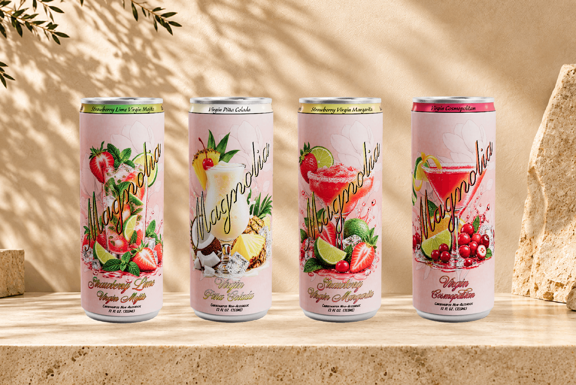
Magnolia; A Soft, Elegant Beverage Concept with Lasting Appeal
Magnolia reflects Logic’s ability to create beverage brands that feel both visually refined and emotionally inviting. With its delicate pink palette, floral inspiration, and cocktail-inspired flavor profiles, Magnolia is designed to capture a more elevated, feminine, and lifestyle-driven expression, while still standing out on the shelf.
From the graceful can design to the carefully layered fruit and drink imagery, every detail communicates beauty, flavor, and mood. The result is a concept that feels fresh, polished, and memorable, ideal for consumers looking for something stylish, expressive, and a little indulgent.
At Logic, we help shape beverage ideas into fully developed brand experiences through thoughtful design, strong visual identity, and packaging that tells a story from the very first glance.
A Magnolia Moment.
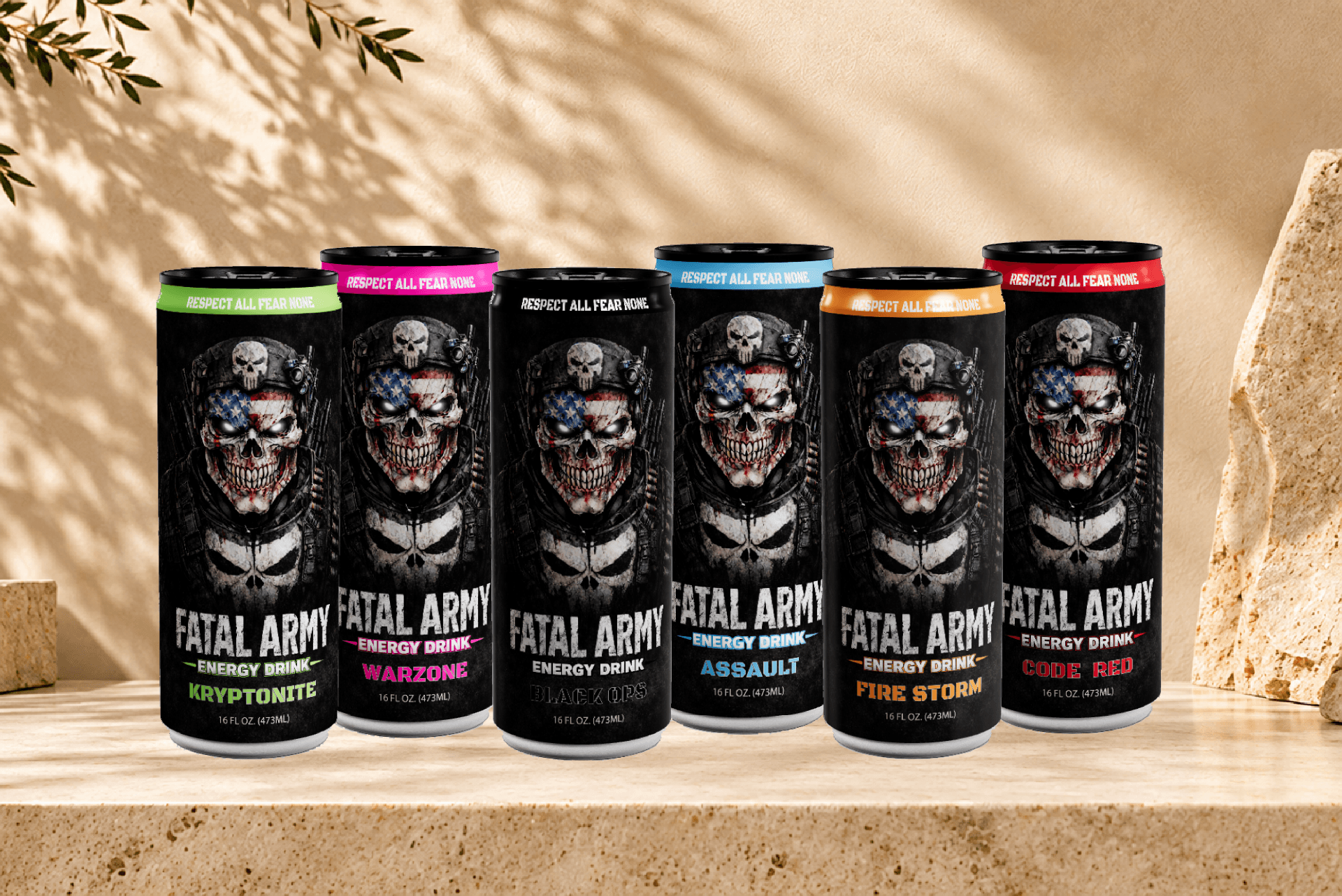
FATAL Army Energy Drink; Built to Make an Impact
FATAL Army is a high-intensity energy drink concept created for a brand that is meant to feel powerful, fearless, and impossible to ignore. The dark military-inspired design, aggressive skull artwork, and bold typography give the range a strong identity, while individual accent colors help separate each flavor without losing the unmistakable FATAL Army look.
From Kryptonite and Warzone to Assault, Fire Storm, Black Ops, and Code Red, the lineup is designed as one connected family, with each 16 oz can carrying its own personality while staying true to the same hard-edged visual language.
For Logic, projects like FATAL Army are about more than designing a can. It is about creating a complete brand presence, one that communicates attitude, audience, and positioning before the consumer has even taken the first sip.
Respect All. Fear None.
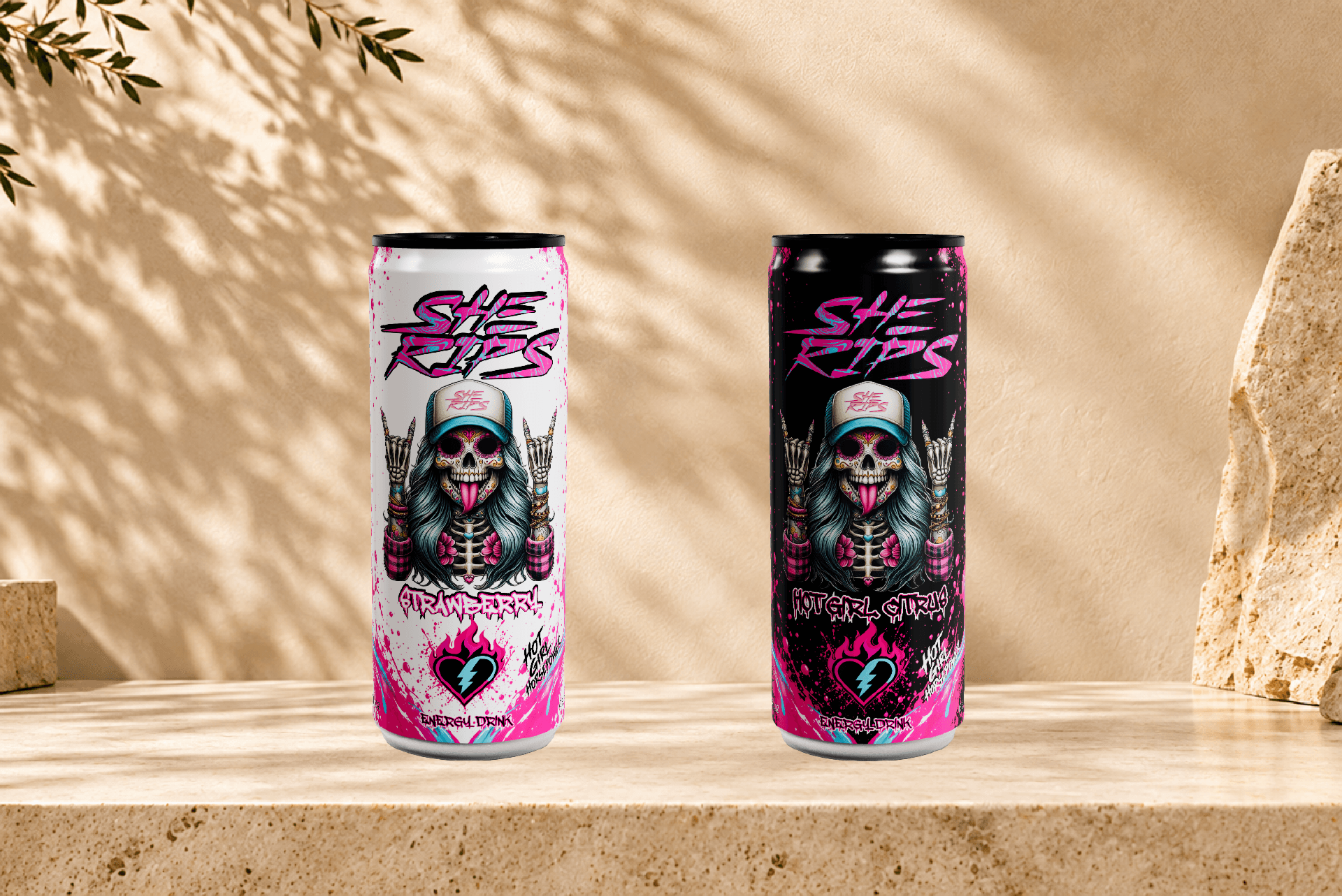
She Rips Energy Drink; Bold, Rebellious, and Built to Stand Out
She Rips is a fearless energy drink concept created for a brand with attitude, personality, and unmistakable visual impact. With its edgy skull-girl artwork, high-contrast black and white can designs, and vivid pink accents, the brand is designed to feel loud, confident, and unapologetically different.
From the custom illustration style to the bold typography and punchy flavor identities, every detail is built to connect with an audience that wants more than just an energy drink, they want a brand that reflects confidence, individuality, and a little rebellion. The result is a product concept that feels energetic, memorable, and ready to make a statement both on the shelf and online.
At Logic, projects like She Rips show how strong packaging design can turn an idea into a lifestyle-driven brand experience, combining visual identity, flavor personality, and consumer appeal into something that is made to be noticed.
Hot Girls Do Guy Shit.
She Rips Coffee; Coffee with Attitude
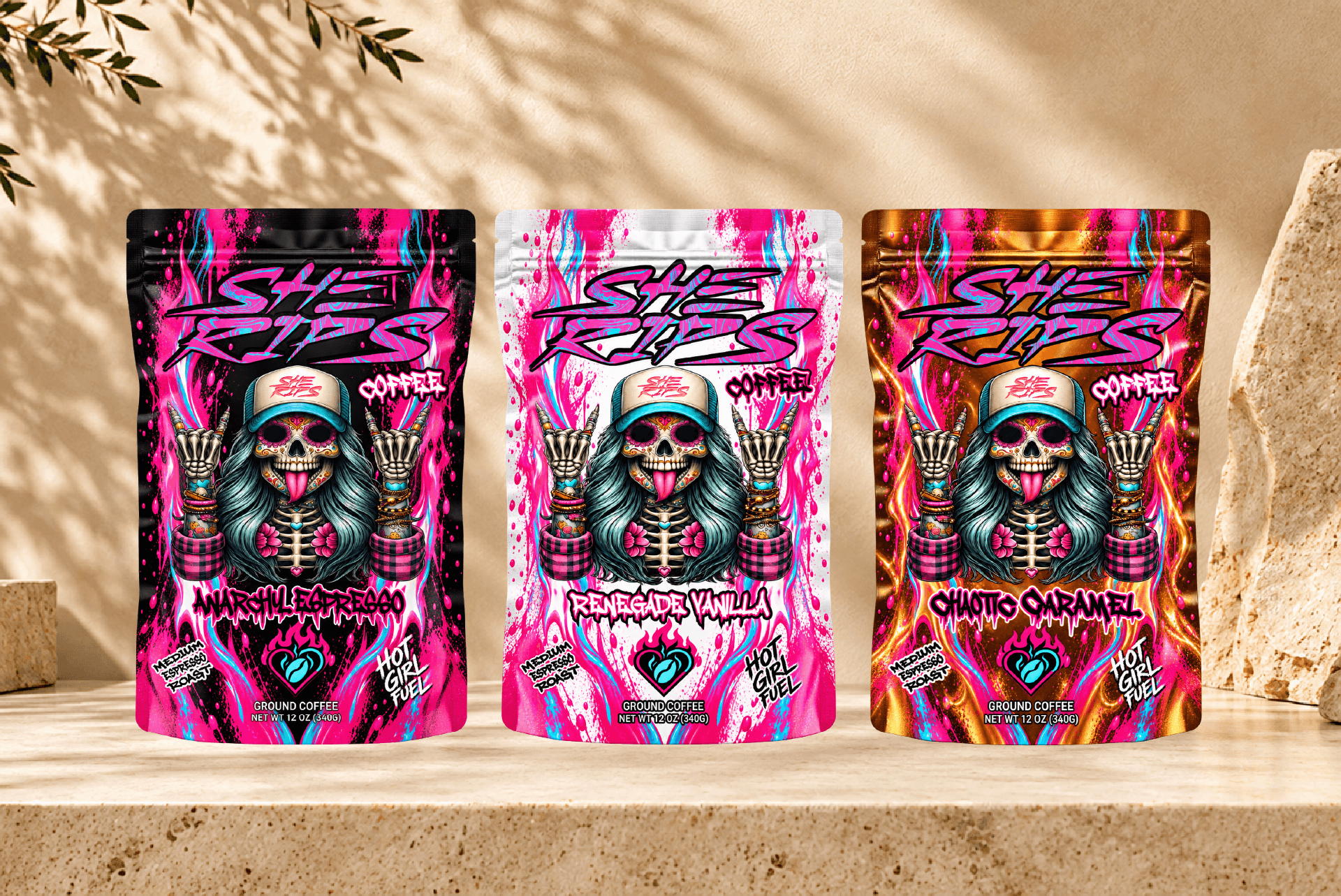
She Rips Coffee takes the fearless personality of the She Rips brand and brings it into a bold new category. Designed around strong character artwork, vibrant pink accents, and highly expressive packaging, the collection turns an everyday coffee product into something with unmistakable shelf presence.
Each variety has its own visual personality, from the darker intensity of Anarchy Espresso to the brighter Renegade Vanilla and the warm metallic tones of Chaotic Caramel, while the shared artwork, typography, and color language keep the entire range connected as one recognizable brand family.
For Logic, She Rips Coffee demonstrates how packaging can do more than identify a flavor. It can create attitude, build consistency across a product line, and give consumers something they instantly recognize and remember.
Hot Girl Fuel.
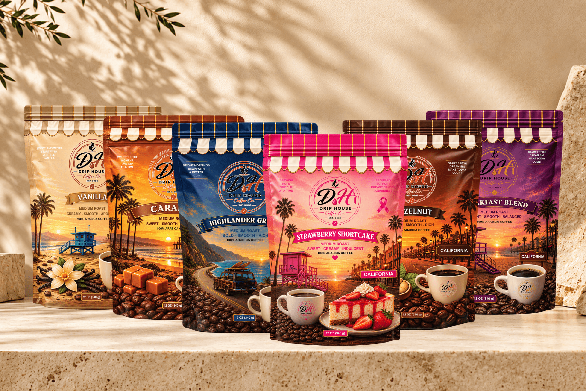
Drip House Coffee; California-Inspired Coffee with Character
Drip House Coffee is built around a warm, inviting visual identity that blends premium coffee cues with the laid-back energy of California. Each variety has its own distinct setting, color palette, and flavor personality, while the shared storefront-inspired design language, coastal scenery, and consistent branding keep the collection connected as one recognizable family.
From the deep purple tones of Breakfast Blend and the rich warmth of Hazelnut and Caramel to the coastal blues of Highlander Grogg, the soft elegance of Vanilla, and the vibrant pink Strawberry Shortcake, every bag is designed to make the flavor feel visible before the first cup is brewed.
For Logic, Drip House Coffee is a strong example of how packaging can combine storytelling, place, and product personality into a cohesive brand system. The result is a collection designed to feel familiar, distinctive, and memorable across the entire lineup.
Start Fresh. Dream Big. Make Today Count.